Sketchnotes experiment part 1: Installation of Hadoop
This post is part of a series. Here’s the introduction and overview.
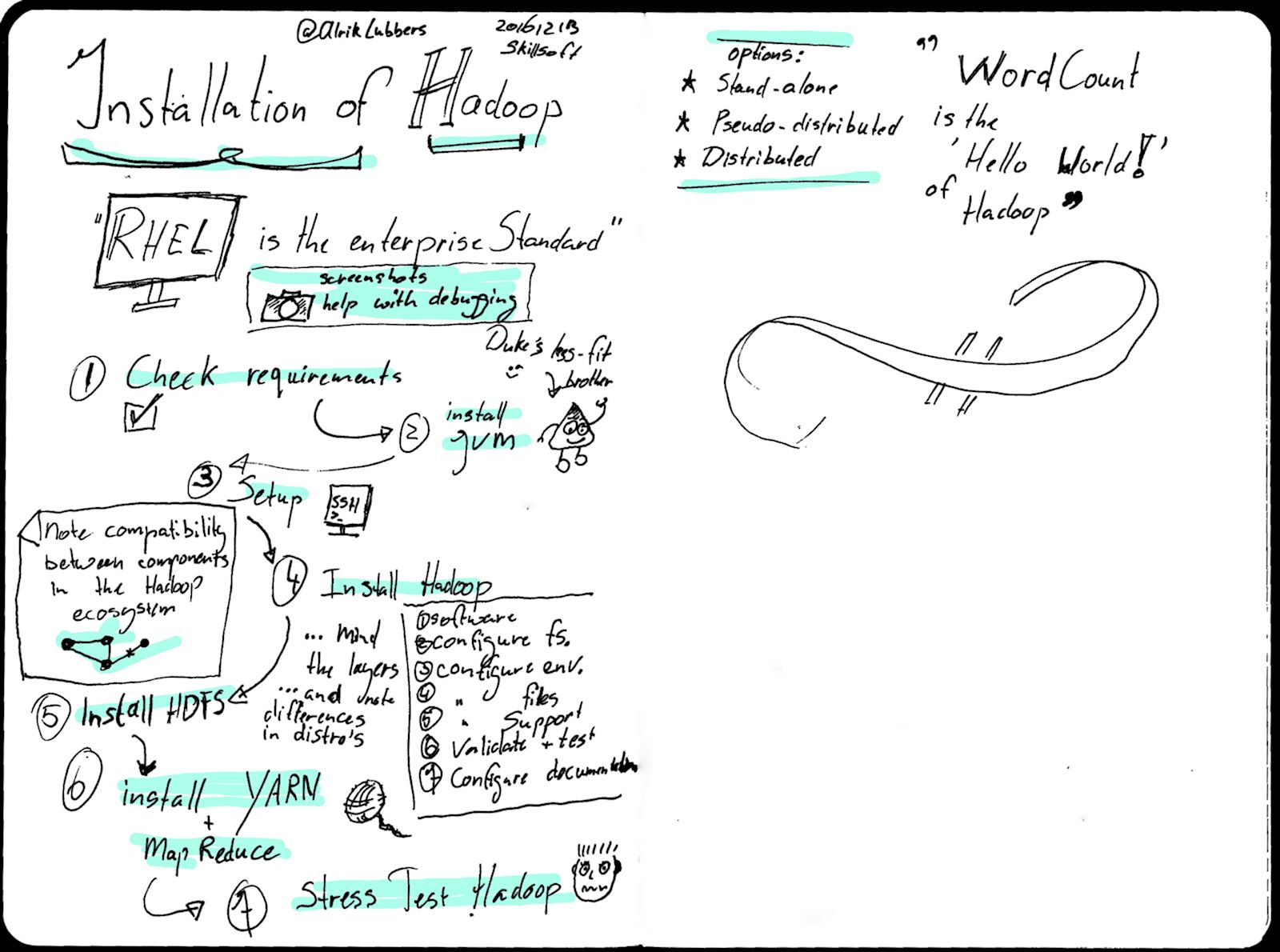
Final image
Sketchnoting
It had been a little while since I last created a sketchnote, which is definitely reflected in the quality of the final image. Lessons learned from this image include:
- In areas the note should be less text-heavy;
- My handwriting isn’t the best in the world, so I should slow down when writing;
- Oops… Ran out of material halfway through the second page…
- The title isn’t very interesting, visually.
Post-processing
The post processing involved a lot of trial and error. The final image was a result of these steps:
- Straighten and crop the scan to the actual size of the notebook;
- Use the Posterize tool to reduce the number of colors (after a lot of playing with Curves, Contrast, Threshold and other options);
- Basic clean-up with Heal and Clone;
- Thicken the lines using Despeckle (small values) and adding a small Gaussian blur. I wasn’t content with the line width and the readability after scanning. It didn’t have a lot of “oomph”. This step solved that for me.
- Add single color accents to a new layer, set to Darken only.
The first image was definitely a struggle. The end result will not set the world of sketchnoting on fire, but it sets a nice baseline to judge any future improvements. Both in taking the sketchnotes and post-processing.
More tk