Sketchnotes experiment part 4: Data Repository with Sqoop
This post is part of a series. Here’s the introduction and overview.
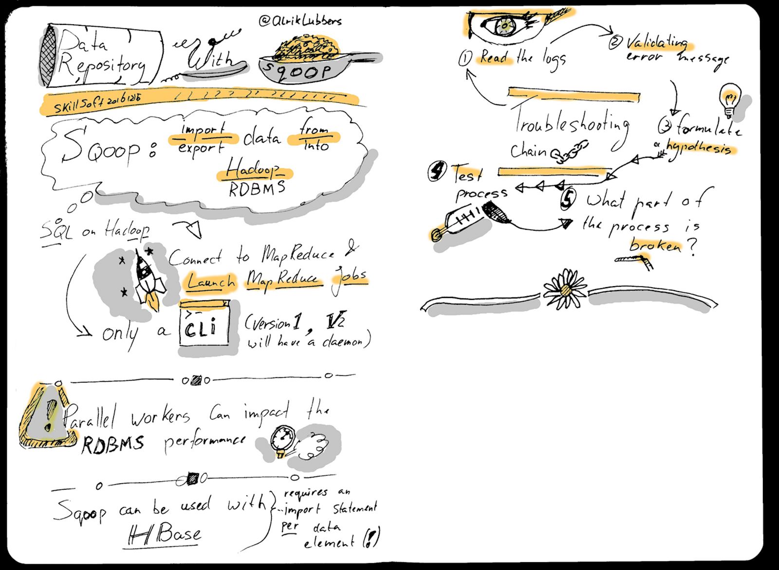
Final image
Sketchnoting
This time around the amount of text may be a bit on the low end of the scale, but overall I’m happy with the result. Lessons learned:
- I like the amount of space that the individual elements get;
- The position of the top illustration on the second page distracts from the title. Next time it should be placed lower on the page;
- My handwriting still needs more attention and there is little variation in the use of type;
- I ran out of material before the end of the second page…
Post-processing
The post-processing technique is quite similar to the previous attempt:
- Crop the scanned image (no straightening required this time! :-) );
- Apply the Threshold tool (values: 140, 255);
- Apply a Gaussian Blur (2.0 x 2.0);
- Clean up the image with the Pencil tool;
- Add grey and colour accents on a new layer with the Brush tool.
This time around I didn’t use an Unsharpen mask before Threshold. As a result the lines are a bit too fine for my taste (yeah, hindsight…).
More tk