Sketchnotes experiment part 6: Data Factory with Pig
This post is part of a series. Here’s the introduction and overview.
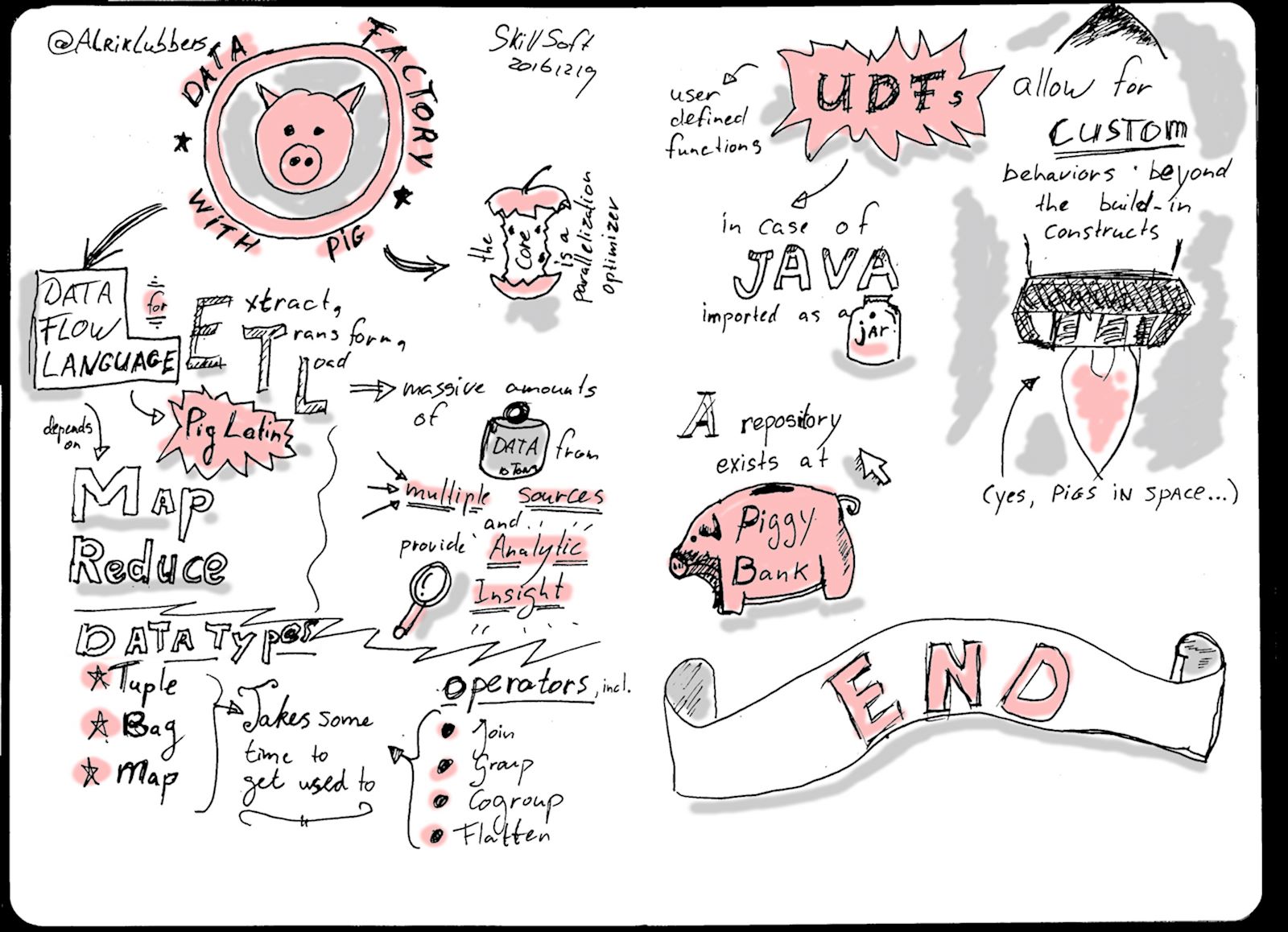
Final image
Sketchnoting
For me, the thing that stands out in this sketchnote is the snout of the piggy bank. I couldn’t get it right the first time, but left the mistake for posterity. So now it looks like a dirty piggy :-) .
Lessons learned:
- Again there was more experimentation with type. I particularly like the quick but interesting doubling of vertical lines in the word “Custom” on the second page;
- I partially fixed it in post, but too much white space on the second page gives a sense of incoherence.
Post-processing
The post processing is familiar by now:
- Straighten & Crop the scanned image;
- Apply an Unsharpen mask and Threshold to clean the bulk of the image;
- Clean borders and small imperfections with the Pencil tool;
- Apply a g Gaussian blur (2.0 x 2.0);
- Add grey & colour accents with a Brush (Size: 50). Of course this should be pink :-) . I reduced the opacity of the colour layer a bit to get the right effect.
More tk