Sketchnotes experiment part 7: Data factory with Oozie and Hue
This post is part of a series. Here’s the introduction and overview.
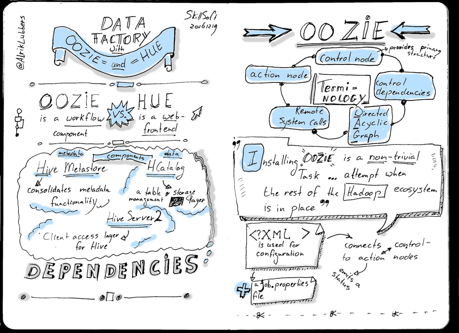
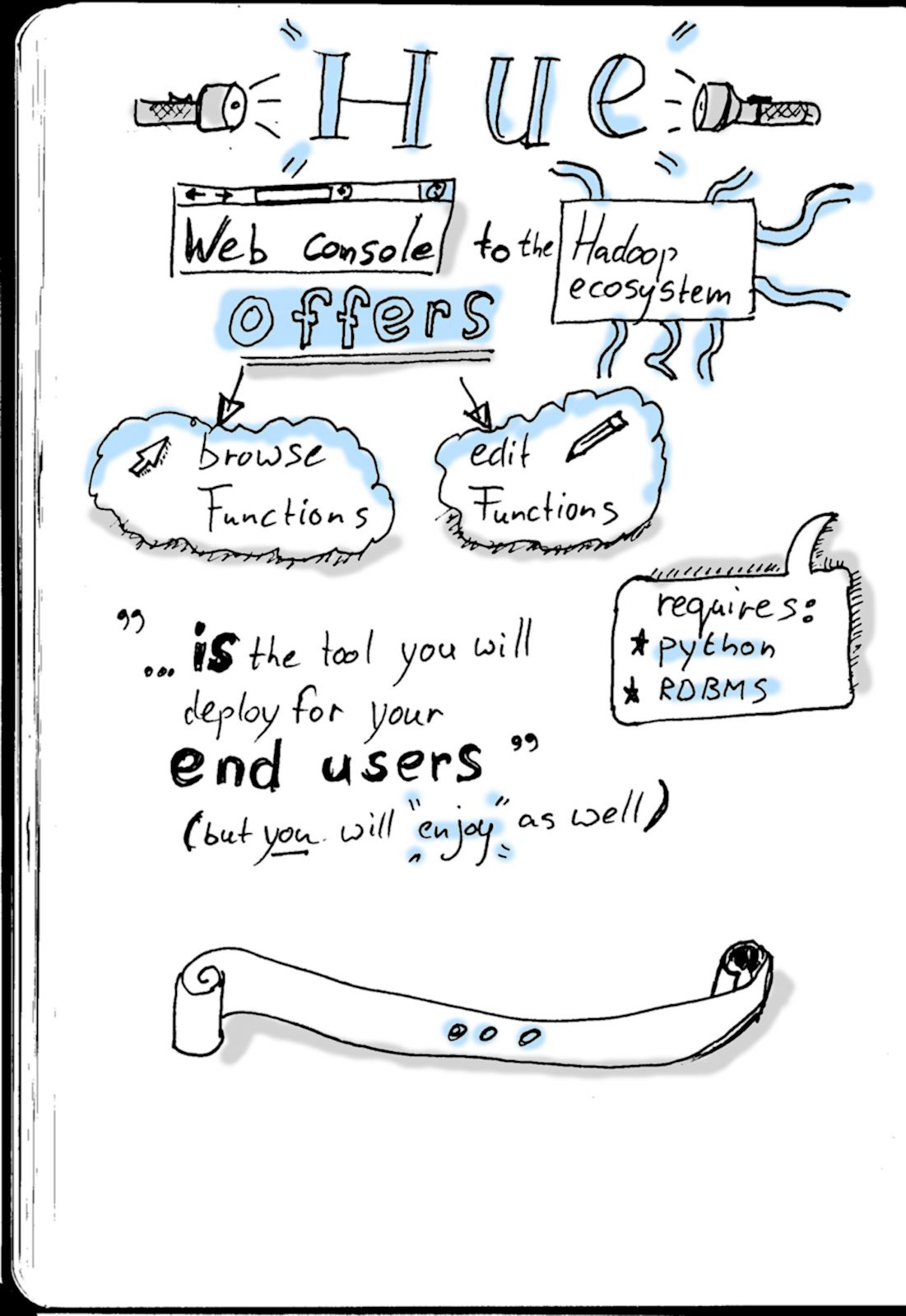
Final image
Sketchnoting
It’s easy to see what happened: I went over 2 pages. Maybe I should get myself an A4 hardback notebook for future experiments. Nevertheless, I like the final result. It’s visually interesting and if you compare it to the first few attempts, there’s a world of difference.
Lessons learned:
- Call-outs are a quick and easy way to add interest to an item;
- The number of illustrations are a bit low. Creating a visual library would probably improve the response time between an idea and the final image.
Post-processing
Post processing is starting to become a second nature:
- Crop & straighten the scanned image;
- Apply an Unsharpen mask (radius: 50, amount: 0.5);
- Apply a Threshold;
- Clean up the image;
- Apply a Gaussian blur (3x3);
- Add grey and colour accents.
When it’s scaled down for the web the 3x3 Gaussian blur isn’t that obvious. However, these days I feel it’s a bit too much and the final result is a bit too blurry at 100%.
More tk